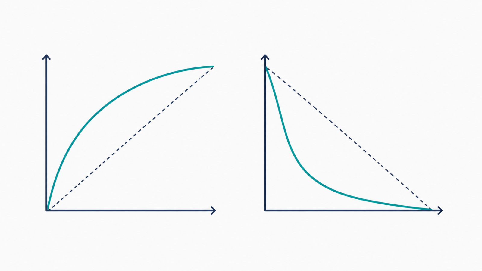
A model can look excellent on an ROC curve and mediocre on a precision-recall curve, using the exact same predictions. Neither curve is lying — they’re answering different questions, and picking the wrong one hides the answer you actually needed.
Precision-recall curve vs ROC curve: what each one measures
An ROC curve plots true positive rate against false positive rate across every possible decision threshold. A precision-recall curve plots precision against recall across those same thresholds. The precision-recall curve vs ROC curve choice matters because false positive rate is calculated relative to all negatives — and when negatives vastly outnumber positives, that denominator hides a lot of real-world false alarms.
Why this choice matters most on imbalanced data
On a dataset that’s 99% negative, a large number of false positives can still produce a tiny false positive rate, because it’s divided by a huge negative count — which makes the ROC curve look deceptively strong. Precision, by contrast, is calculated relative to everything the model flagged as positive, so it stays sensitive to false alarms regardless of how imbalanced the classes are. That’s the core reason the precision-recall curve vs ROC curve debate leans toward precision-recall for rare-event problems.
A real example: imbalanced security data
The network intrusion detection project reports per-class precision and recall on the NSL-KDD benchmark rather than leaning on a single ROC-based summary — with rare attack classes vastly outnumbered by normal traffic, a precision-recall view surfaces exactly the false alarms and missed attacks that an ROC curve’s favorable-looking false positive rate could otherwise obscure.
A real example: asymmetric costs
The visual quality inspection project deals with the same underlying tradeoff from a cost perspective: a missed defect reaches a customer, while a false alarm wastes an inspector’s time. Choosing between precision-recall and ROC framing here isn’t academic — it changes which threshold looks “best,” because the two curves emphasize different kinds of mistakes.
When ROC is still the right choice
ROC curves aren’t wrong — they’re the better choice when classes are roughly balanced, or when both classes matter equally and you genuinely care about the full false-positive-rate tradeoff rather than precision specifically. AUC-ROC also has a clean, threshold-independent interpretation (the probability a random positive ranks above a random negative) that’s useful for comparing models overall, separate from any single operating point.
A quick checklist
- Is your positive class rare relative to the negative class? If so, lean precision-recall.
- Does a false positive cost meaningfully more or less than a false negative in your problem? Precision-recall makes that asymmetry visible; ROC can hide it.
- Are you comparing multiple models overall, independent of a specific threshold? AUC-ROC is a reasonable single-number summary for that.
- Have you checked whether your ROC curve looks better than your precision-recall curve purely because of class imbalance, not real model quality?
FAQ
Is AUC-PR always better than AUC-ROC?
Not universally — AUC-PR is generally more informative on imbalanced data specifically. On balanced datasets, the two often tell a similar story.
Can I report both curves?
Yes, and it’s often the safest choice — reporting both lets a reviewer see the full picture rather than trusting a single, potentially misleading summary.
Does the precision-recall curve vs ROC curve choice affect which threshold I pick?
Yes — the “best” threshold according to an ROC-based metric like Youden’s J can differ from the best threshold by F1 or a precision-recall tradeoff, especially on imbalanced data.